The Challenge
Getting visitors to a store is only one part of ecommerce growth. Once they arrive, the product page needs to answer their questions and help them understand what they are buying.
For this project, the central challenge was turning interest into purchases. The page needed to communicate the product, explain the available offers, and give shoppers a straightforward route to checkout.
The redesign focused on three questions:
- Can visitors quickly understand the product and offer?
- Can they compare purchase options without confusion?
- Can they find the information they need before ordering?
Reviewing the Customer Journey
Before changing the layout, our proposed review covered the journey from landing on the product page to adding an item to the cart.
We examined how product images, descriptions, pricing, bundle choices, and supporting information worked together. The aim was to identify places where shoppers might need more clarity or encounter unnecessary friction.
This review helped establish priorities for the redesign: clearer visual hierarchy, easier offer comparison, organized product information, and a more prominent purchase area.
What We Redesigned
A Clearer Product Presentation
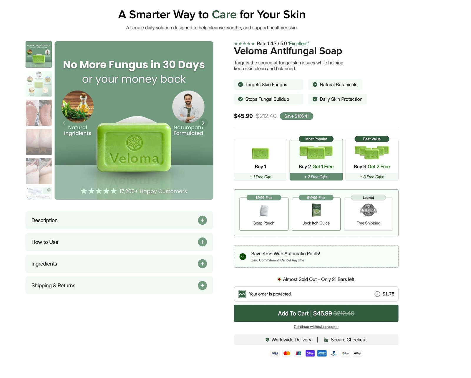
The redesigned layout places the product gallery beside the main purchase information. Visitors can view the product while reviewing its description, pricing, and available options.
The page uses consistent spacing and a coordinated green palette to connect the product imagery with the rest of the design.
More Organized Product Information
Important information is grouped into dedicated sections, including:
- Description
- How to Use
- Ingredients
- Shipping & Returns
Expandable panels keep this information accessible while reducing clutter around the main purchase area.
Easier Bundle Comparison
The purchase section presents three bundle options together. This allows shoppers to compare quantities and available offers without moving between separate pages.
Labels such as “Most Popular” and “Best Value” distinguish the options visually. These labels, savings, and promotional details should reflect the actual offer.
A More Visible Purchase Area
The add-to-cart button sits beneath the purchase options and related order information. This creates a clear sequence: review the product, choose an option, and proceed.
Delivery and checkout information also appear close to the purchase area, where shoppers may look for reassurance before ordering.
A Consistent Visual Structure
The redesign brings headings, cards, buttons, and information panels into a consistent system. This helps shoppers move through the page and understand which information deserves attention first.
How the CRO Work Supported Growth
Conversion rate optimization focuses on helping more visitors complete the intended action. In this project, that meant making the product page easier to understand and shop.
The work connected several parts of the buying experience: product presentation, offer selection, supporting information, and the add-to-cart step. Together, these changes aimed to reduce uncertainty and make purchasing more straightforward.
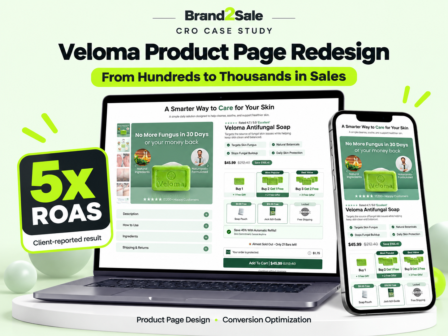
Following the CRO work, the client reported moving from hundreds to thousands in sales and achieving 5x advertising ROAS. The page redesign formed part of that growth effort; the available information does not isolate its contribution from advertising or other business changes.
Reported Results
| Metric | Reported outcome |
|---|---|
| Sales before the project | Hundreds per Week |
| Sales following the CRO work | Thousands per Day |
| Advertising ROAS | 5x |
| Project focus | Product page design and conversion optimization |
A 5x ROAS means five units of attributed advertising revenue for every unit spent on advertising. It does not represent net profit.
Project Takeaway
A product page should help customers make a decision. Clear information, understandable offers, and an organized purchase experience can support the traffic a brand already receives.
For Veloma, Brand2Sale’s work focused on bringing those elements together in one product page.
Want a Clearer Shopping Experience?
If visitors are reaching your store but sales are falling short, your product page is a useful place to start. Brand2Sale can review your layout, product presentation, and purchase journey to identify practical improvements.